Bushwick Block Party
Graphic Design / Illustration / Web Design: Hanna Shibata
Editorial Design: Alice Choi, Chi-Wei Tseng
Pratt Institute (2019)
Studio Experiment with Alice Choi, Chi-Wei Tseng
ABOUT
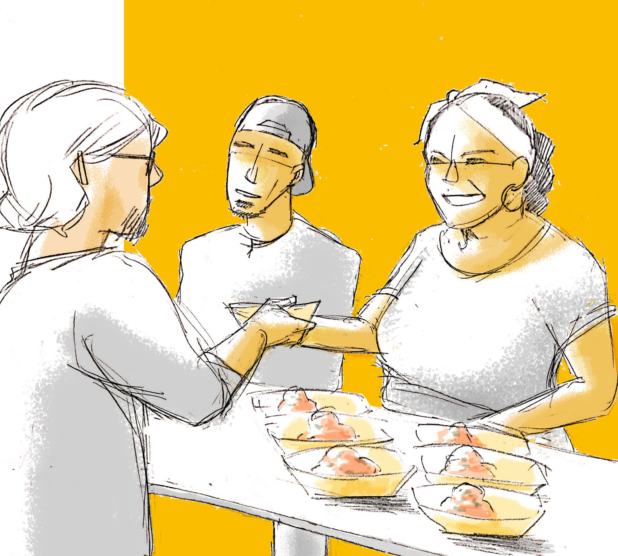
The project aims to suggest a design solution for a divided community to help and support a sustainable society.
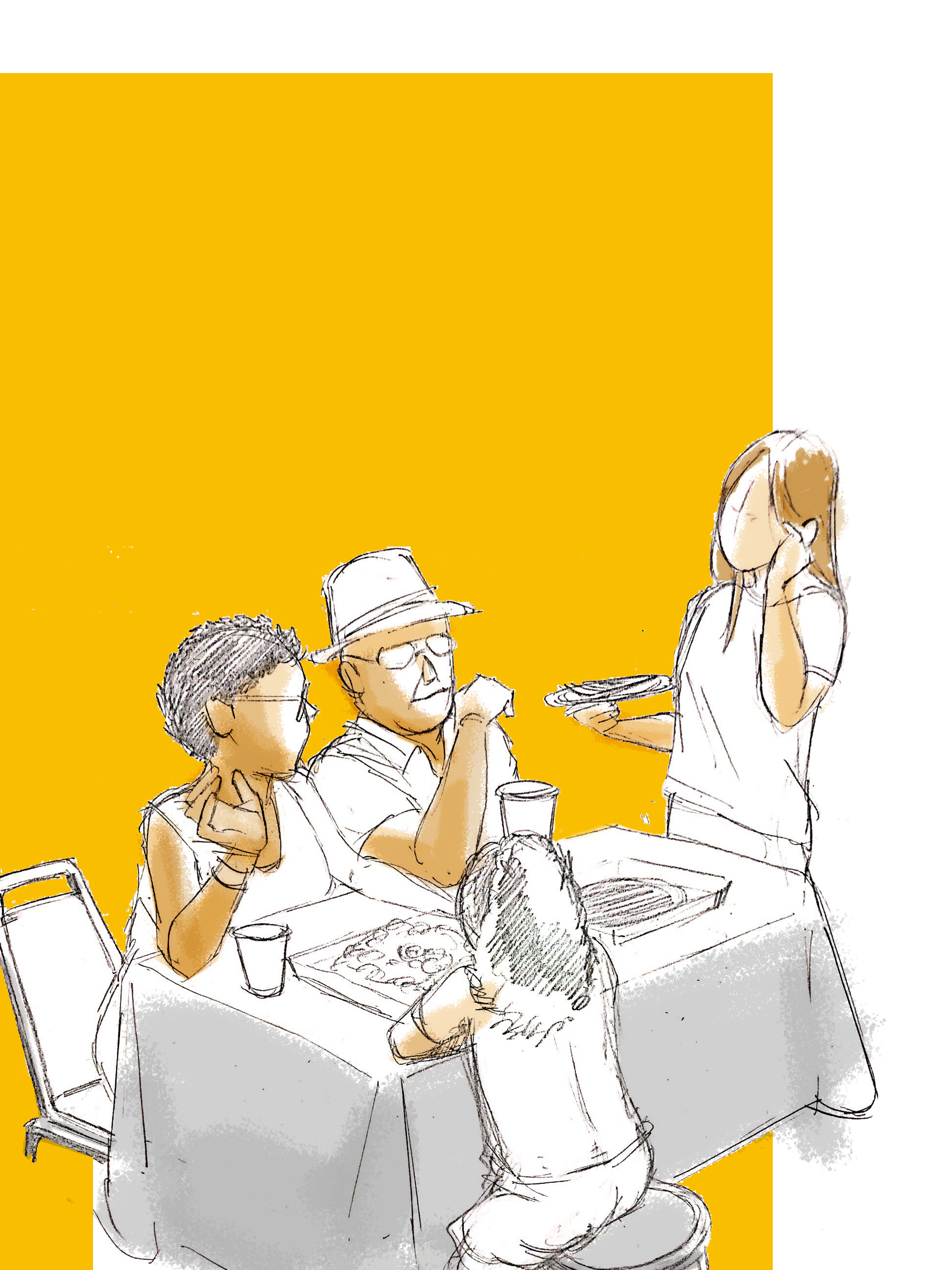
By conducting on-site observation, we figured out that Bushwick is founded on a complex mixture of history and culture. The whole borough is famous for its beautiful murals, art, culture, independence, and residents' full awareness of their well-being in the neighborhood.
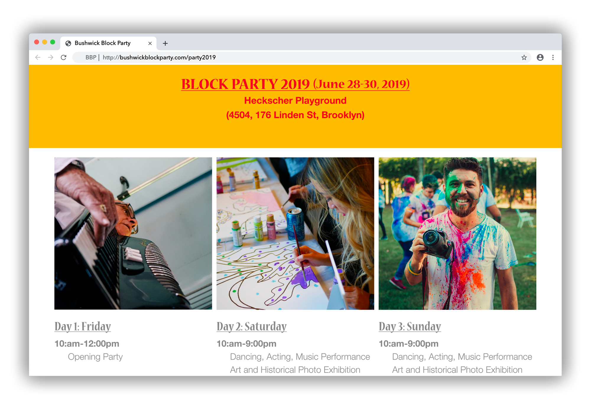
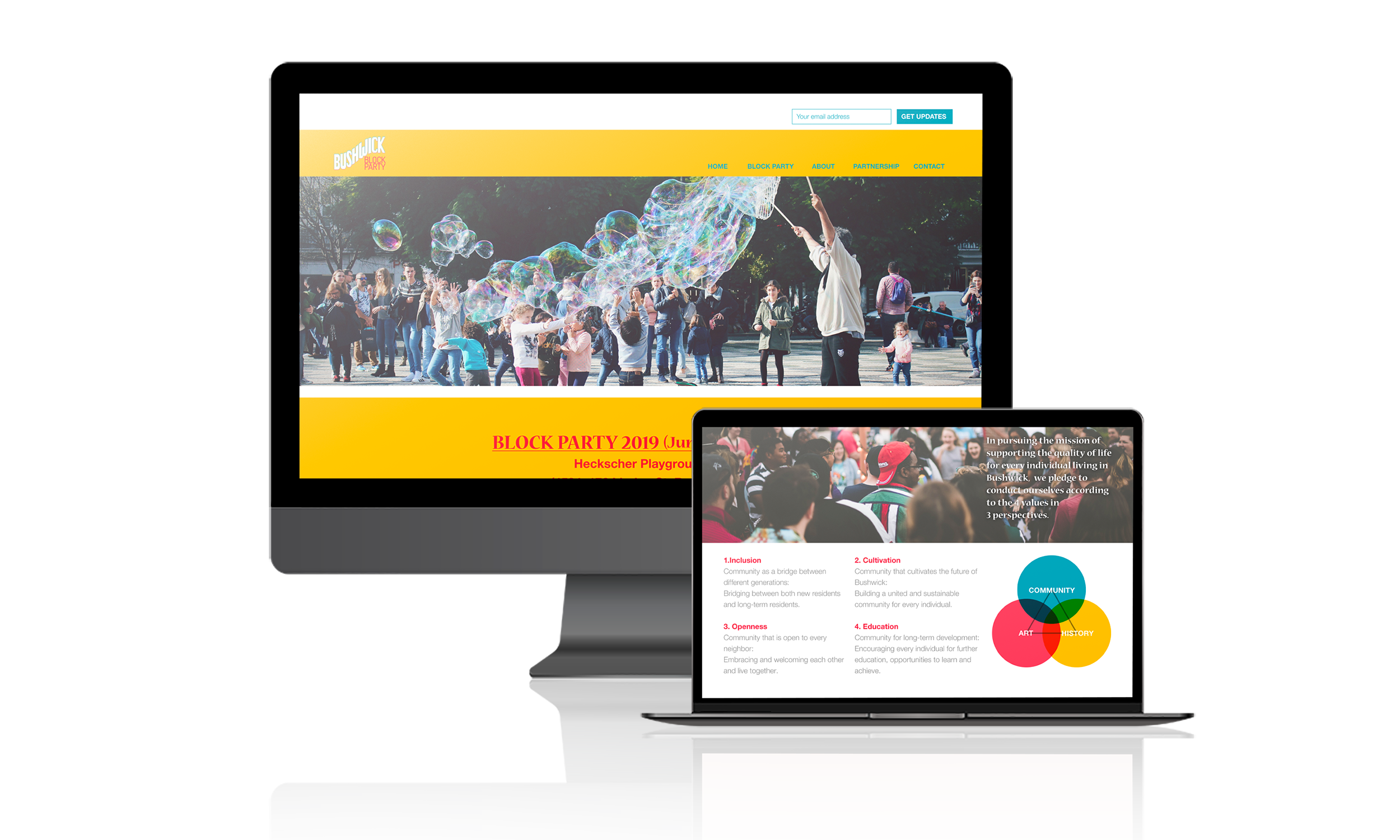
When designing this visual identity, I hoped to show solidness and toughness through design—not too clean and thin, and make sure to be welcoming. The website is designed to show the purpose of this project, as simple as it can be and fun.
The project aims to suggest a design solution for a divided community to help and support a sustainable society.
By conducting on-site observation, we figured out that Bushwick is founded on a complex mixture of history and culture. The whole borough is famous for its beautiful murals, art, culture, independence, and residents' full awareness of their well-being in the neighborhood.
When designing this visual identity, I hoped to show solidness and toughness through design—not too clean and thin, and make sure to be welcoming. The website is designed to show the purpose of this project, as simple as it can be and fun.
DESIGN DECISION
As stated, the design decision was always set under solid / tough / welcoming.
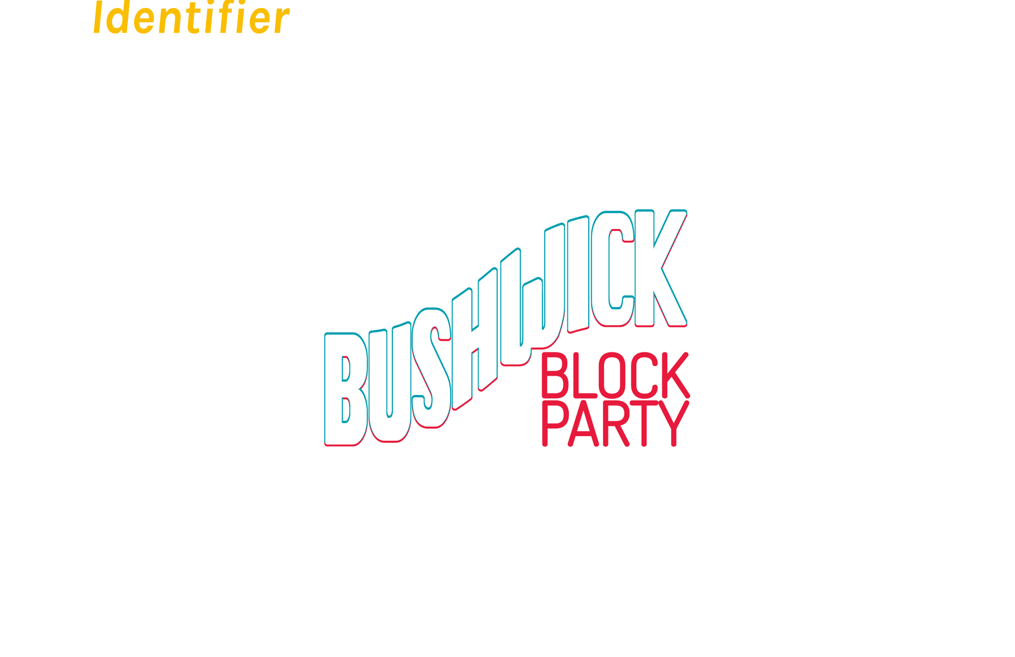
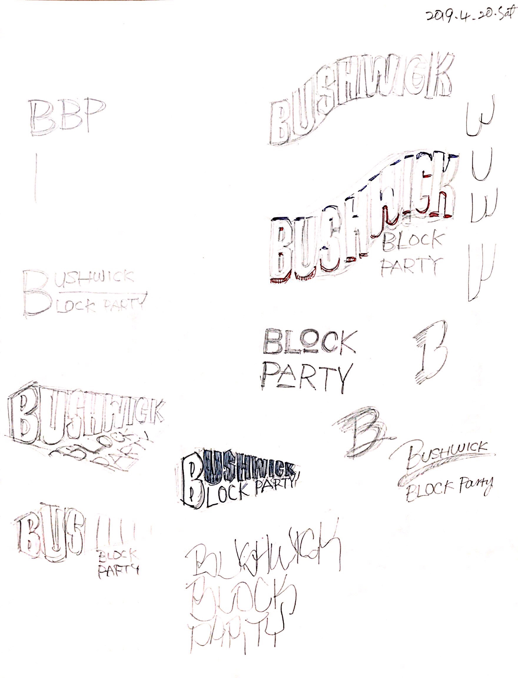
The form of the identity was made from scratch, drawn on paper, primarily inspired by one of the murals seen on the street.
Color selection was also made under the same concept. Bushwick has been a unique place from the past, which was not always an easy straight path. The tireless effort of discussion communication under every confronting situation.
The typeface chosen for this project is Helvetica and Nueva.
Helvetica is classic but perfect for its stability and legibility. The choice in Nueva aimed to add the neighborhood's energetic atmosphere while distinguishing it from Helvetica's form.
As stated, the design decision was always set under solid / tough / welcoming.
The form of the identity was made from scratch, drawn on paper, primarily inspired by one of the murals seen on the street.
Color selection was also made under the same concept. Bushwick has been a unique place from the past, which was not always an easy straight path. The tireless effort of discussion communication under every confronting situation.
The typeface chosen for this project is Helvetica and Nueva.
Helvetica is classic but perfect for its stability and legibility. The choice in Nueva aimed to add the neighborhood's energetic atmosphere while distinguishing it from Helvetica's form.