Building an identity for a tech startup
Corporate Identity for Fathom Optics
Corporate Branding, Visual Identity, Brand System, Communication Design
- Team: Fathom Optics
- Logo Design: Justin Hirsch
- Lead Designer: Hanna Shibata
OVERVIEW
Fathom Optics Inc. comes from the Media Lab Spinoff at MIT. They have a brand-new idea about next-generation printing. At the very early stage of a startup, Fathom had a logotype with a tagline designed by one of the founders’ brother, typefaces they chose, and a brand guideline that was not quite familiar to everyone. They were also struggling to create cohesive brand communication and resources, so I volunteered to develop clear and easy-to-follow guidelines and help build a brand visual identity.
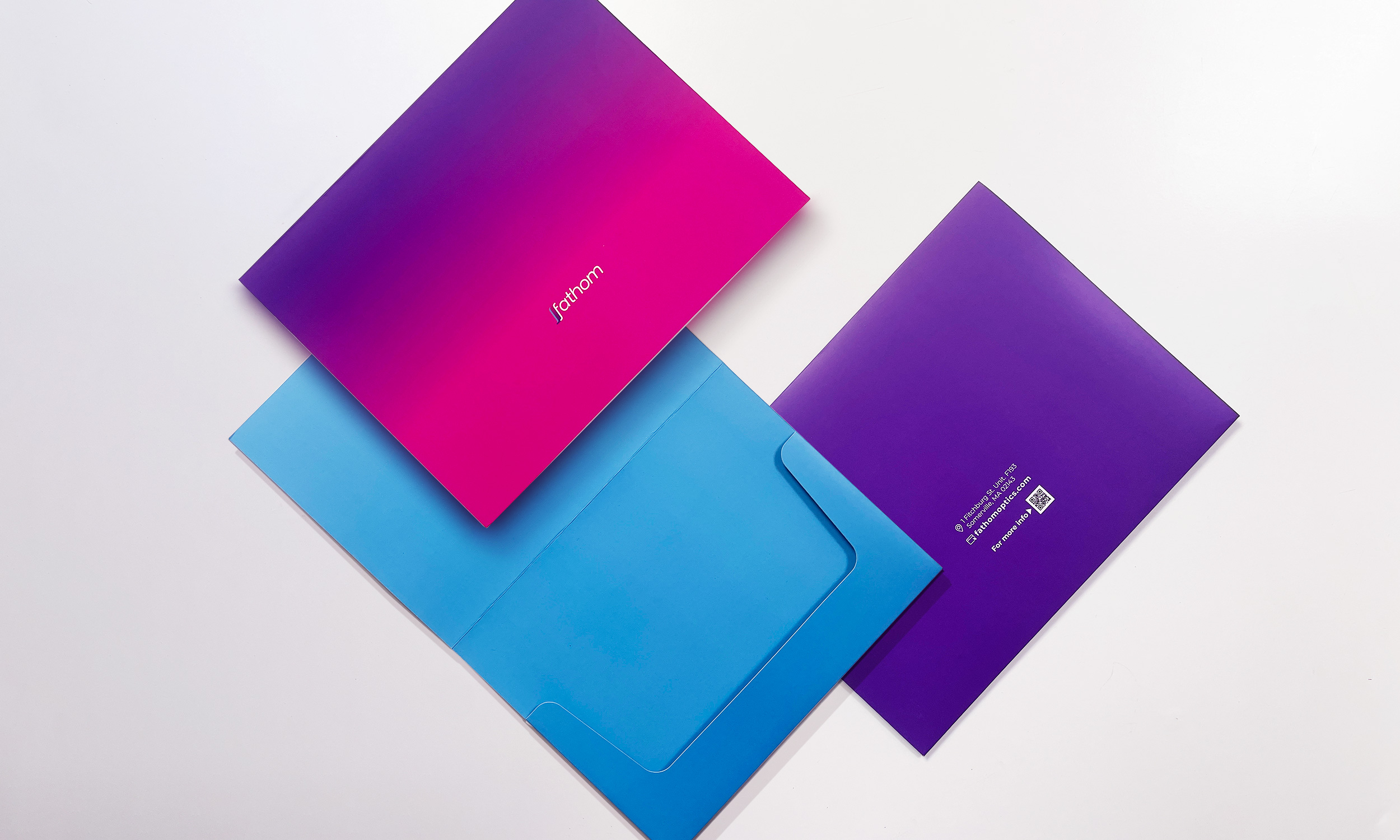
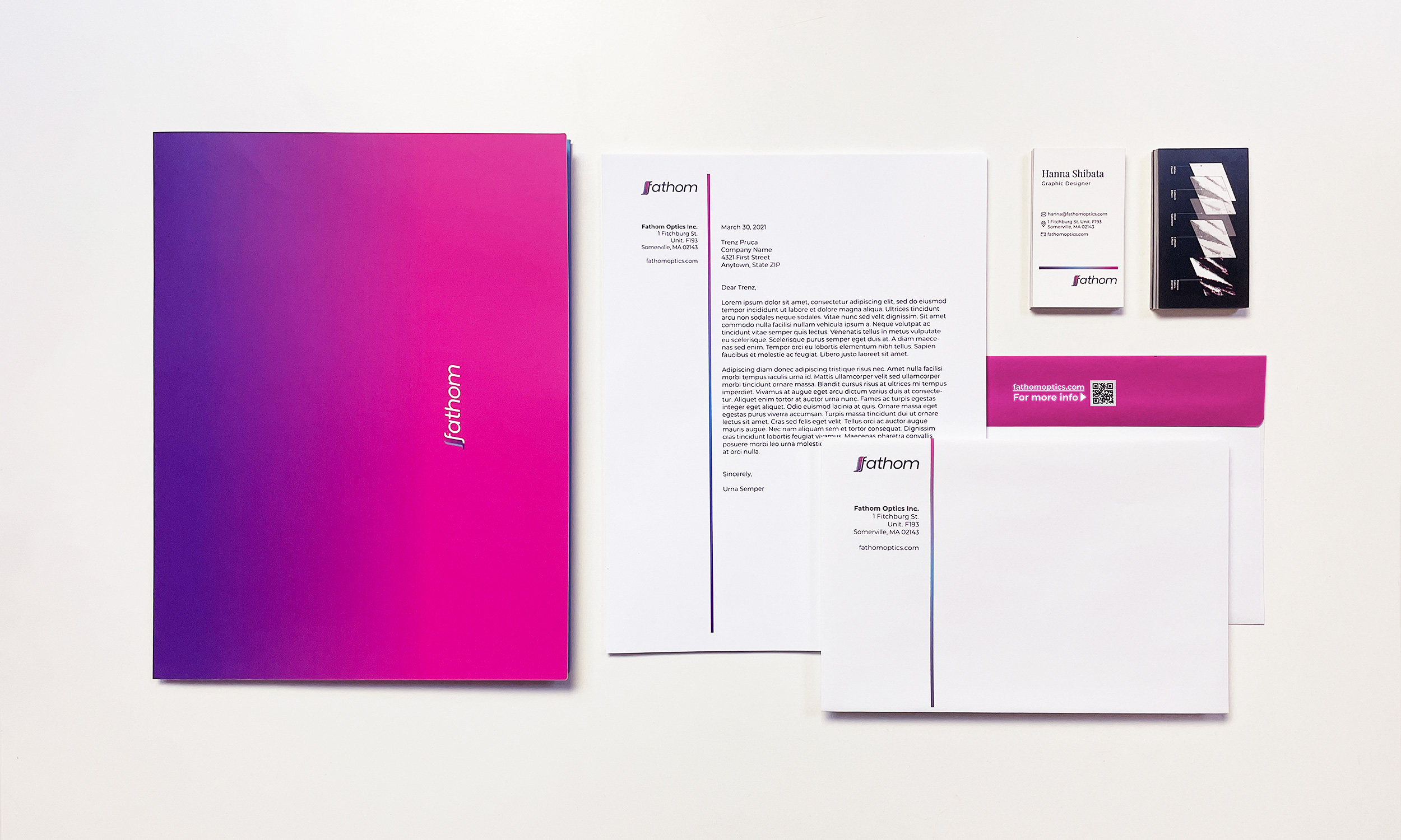
This project started by recognizing and rebuilding its brand identity. Alongside the brand guideline, I suggested a few templates for social media content. I also created communication tools such as letterhead, folder-type envelopes for sending out samples, business cards, etc., to support the overall brand communication and experience.
CHALLENGES
My colleagues had little experience understanding brands and how brand regulations can help preserve a consistent narrative when handled well. I wanted to help them by reorganizing the guidelines and making them simple and easy to use.
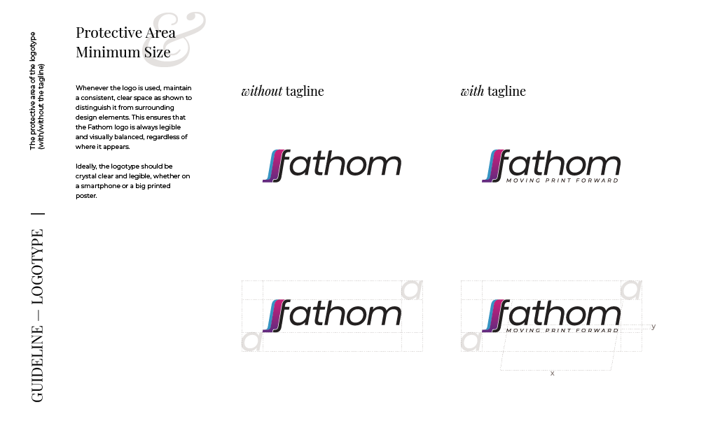
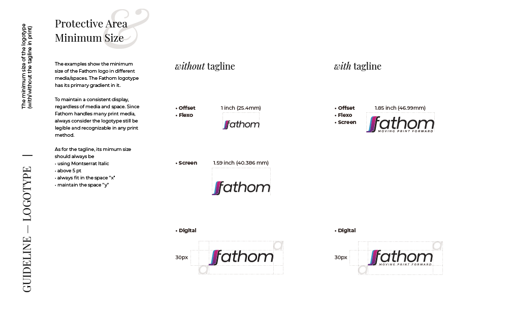
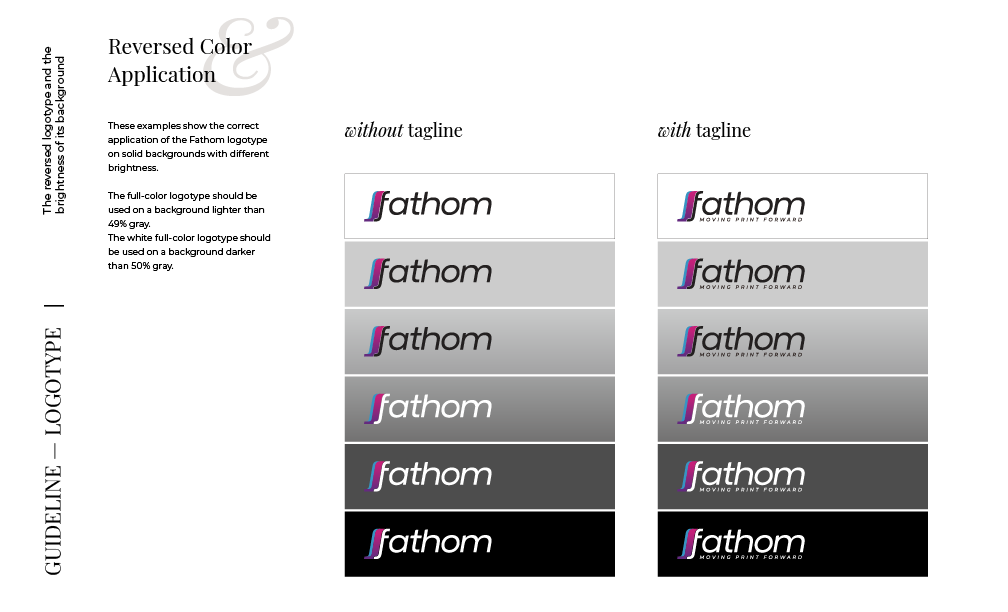
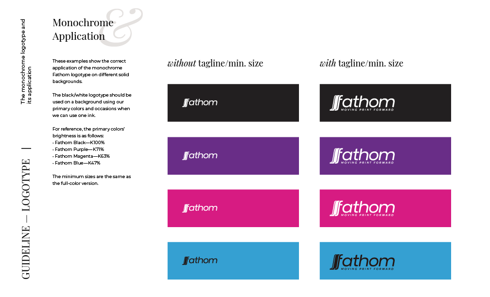
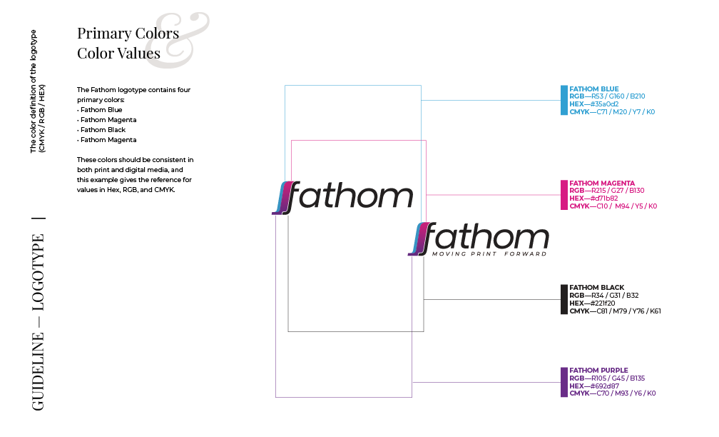
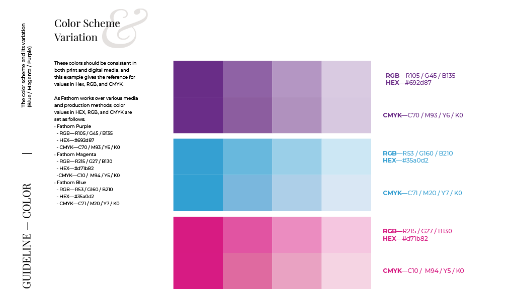
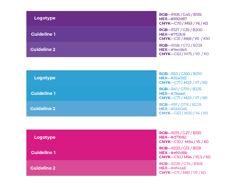
Since Fathom handles many prints and communicates through various social media channels, consistency was the top priority. One challenge was the logotype's scalability and replicability. For instance, I found out that there were three different shades of logo files used among my colleagues—what is the best way to address this when they are not aware of the issue?
SOLUTION
I talked to everyone inside and outside the design team to ensure that our publications followed the guidelines. I also started the conversation with the founders and the team about what our brand voice should sound like. It was a great exercise for everyone, allowing us to think deeper about the brand and elevate the company-wide communication strategy.
I set each guideline for digital/non-digital settings and made it as simple as possible, preserving the details, so the new corporate identity would help elevate the brand experience.