Fathom Optics Inc.
Corporate Branding / Visual Identity / Brand System /Communication Design
Fathom Optics Inc. (2022)
ABOUT
This project started by recognizing and rebuilding its brand identity. At the very early stage of a startup, Fathom had a logotype and typeface they wanted to use and a brand guideline that no one read. What they didn't have was someone who could lead the brand to create a brand experience and communication resources — so I raised my hand to make clear and easy guidelines and build a branding strategy.
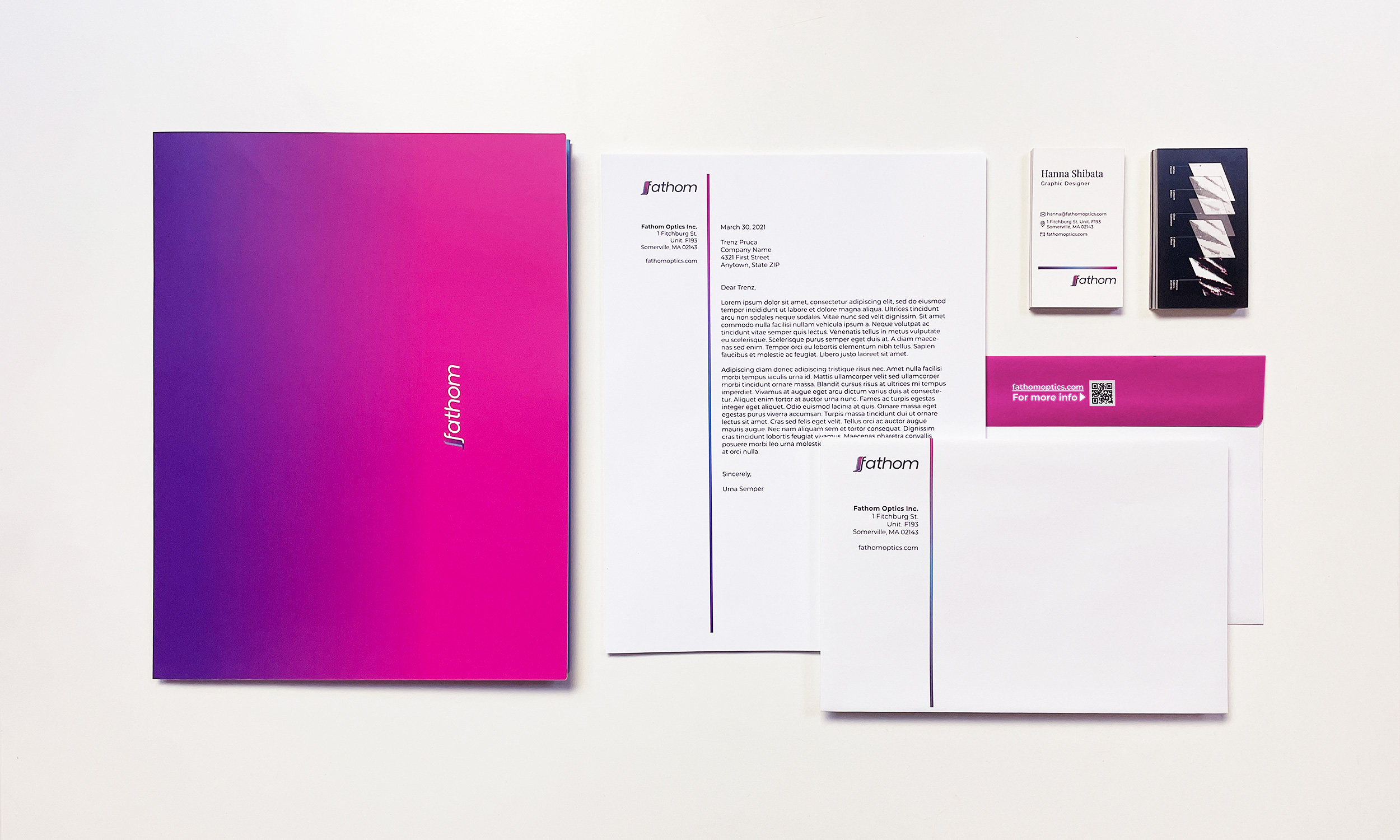
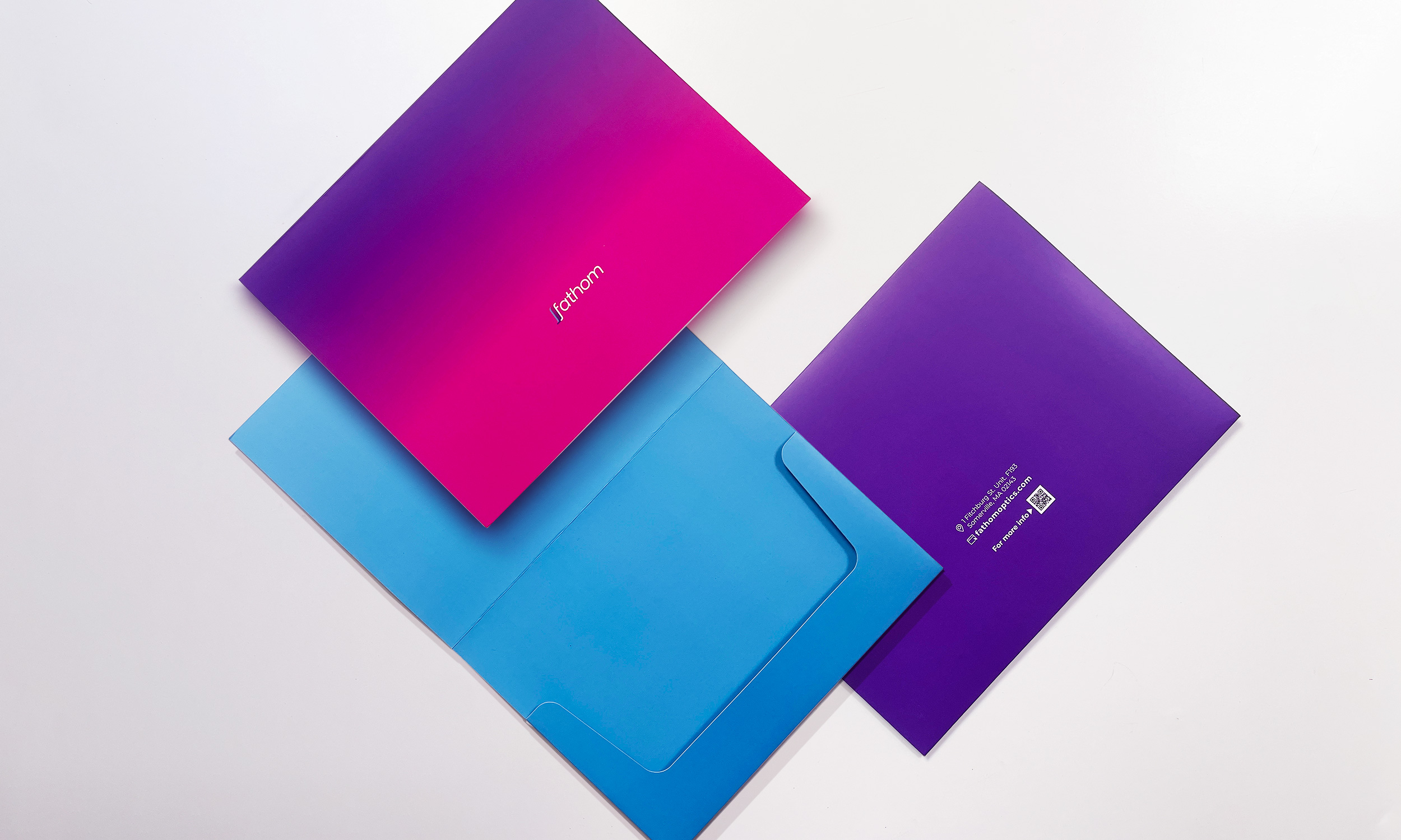
Alongside the brand guideline, I suggested a few templates for social media content. I also created communication tools such as letterhead, folder-type envelopes for sending out our samples, business cards, etc., to support the overall experience.
This project started by recognizing and rebuilding its brand identity. At the very early stage of a startup, Fathom had a logotype and typeface they wanted to use and a brand guideline that no one read. What they didn't have was someone who could lead the brand to create a brand experience and communication resources — so I raised my hand to make clear and easy guidelines and build a branding strategy.
Alongside the brand guideline, I suggested a few templates for social media content. I also created communication tools such as letterhead, folder-type envelopes for sending out our samples, business cards, etc., to support the overall experience.
DESIGN DECISION
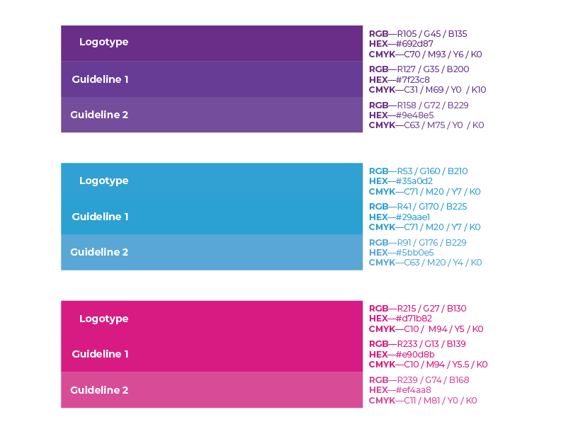
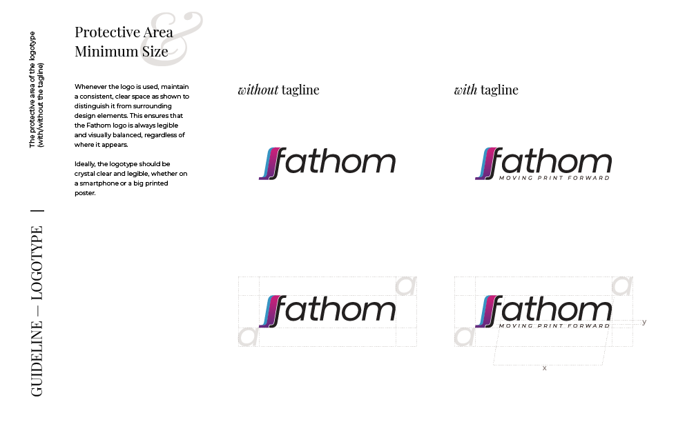
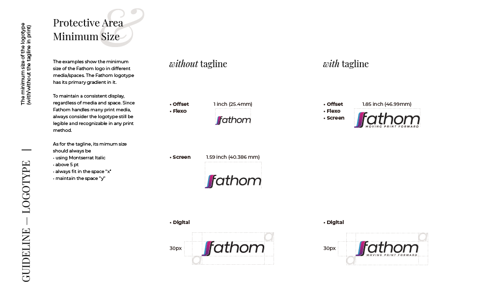
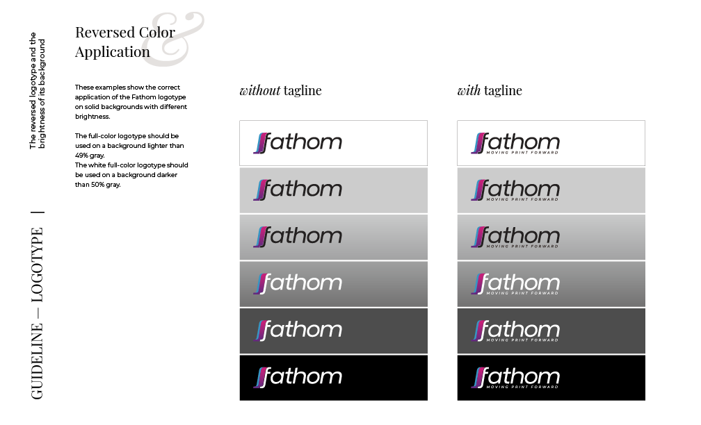
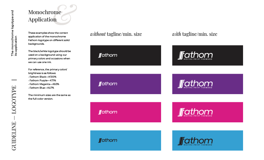
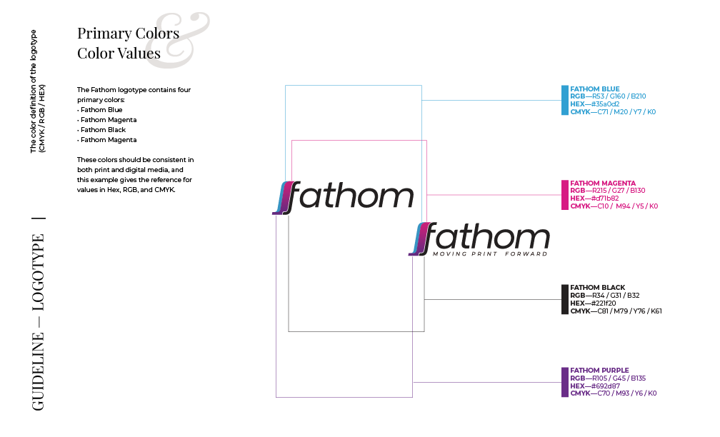
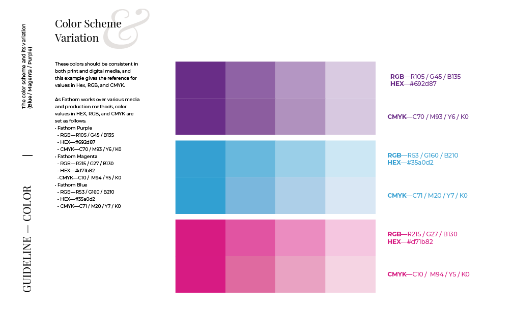
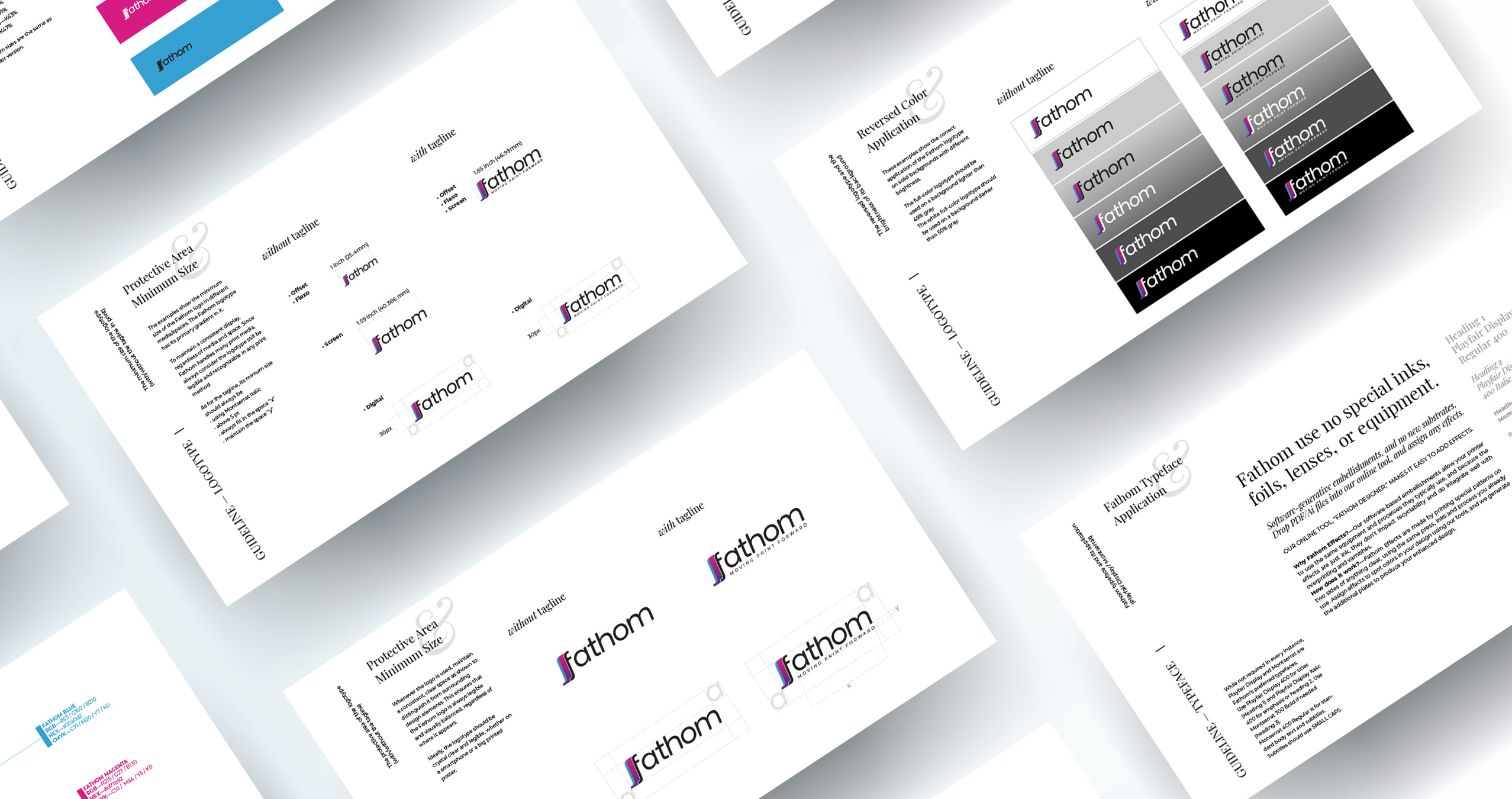
Since Fathom handles many prints but communicates through various social media channels, consistency was the top priority.
However, their logotype, which they had been using long before I joined, was hard to replicate across media. It had a detailed form, including a small gradient.
I set each guideline for digital/non-digital settings and made it as simple as possible, so the new corporate identity would help elevate the brand experience.
CHALLENGES
My colleagues didn't have experience thinking about what a brand is and how brand regulations can be useful to preserve a consistent narrative when handled well. I wanted to help them by reorganizing the guideline and making it simple and understandable.
I took time to talk to everyone inside and outside the design team to make sure our publications were done following the guideline. I also started the conversation with the founders and the team about what our brand voice should sound like. It was a great exercise for everyone, allowing us to think deeper about the brand and elevate the company-wide communication strategy.
I took time to talk to everyone inside and outside the design team to make sure our publications were done following the guideline. I also started the conversation with the founders and the team about what our brand voice should sound like. It was a great exercise for everyone, allowing us to think deeper about the brand and elevate the company-wide communication strategy.