Brand Refresh for a Two-Decade Old Skincare Brand

La mente
Art Direction, Brand Strategy & Development, Package Design, Market Research, Project Management
- Brand Director: Hanna Shibata
- Art Director: Yoshimasa Saruya
- Photographer: Masato Sato
- Assistant Designer: Yuri Uratani
OVERVIEW
LA MENTE is a Japan Natural Laboratories' skincare brand that started around 2000, focusing on creating gentle skincare for delicate skin. The most unique feature of the brand is its exceptional formula and traceability of all the ingredients it uses. The company is part of a group that manufactures and processes raw materials for cosmetic ingredients. The amount and the concentration of active ingredients are incomparable to any other.
CHALLENGE
But how did they start to suffer as a brand? — The answer was the neglected brand equity.
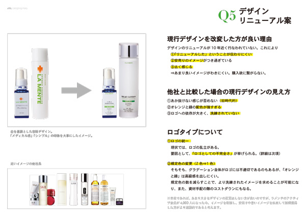
For almost 20 years, LA MENTE hasn't changed its design or brand lineup. While the brand was eating up its brand equity for more than 10 years, it was also suffering from scalping and cheap sales and desperately needed to develop new customers. Alongside the unauthorized reselling, another factor that destroyed the brand value was the loss of the guidelines and design regulations.
What can be a solution to this? — It was expanding the brand with adding new lineup and renewing the design language for the existing lineup.

Amplifying the brandscape
with La Mente Fino
An upgraded look and feel for a two-decade-long customers.
Solution: Brand Expansion
The first step to approach the project was rigorous research. It involved sorting out the remaining products in every size and material and analyzing customer and sales data. Based on the examinations and the budget, I restated the brand and adjusted the overall visual design of the product.
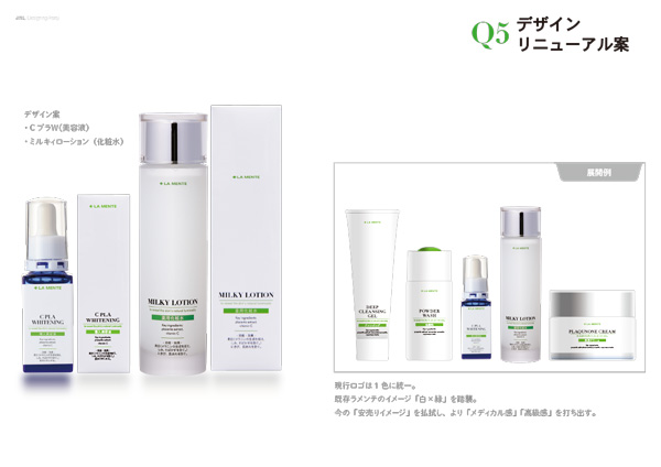
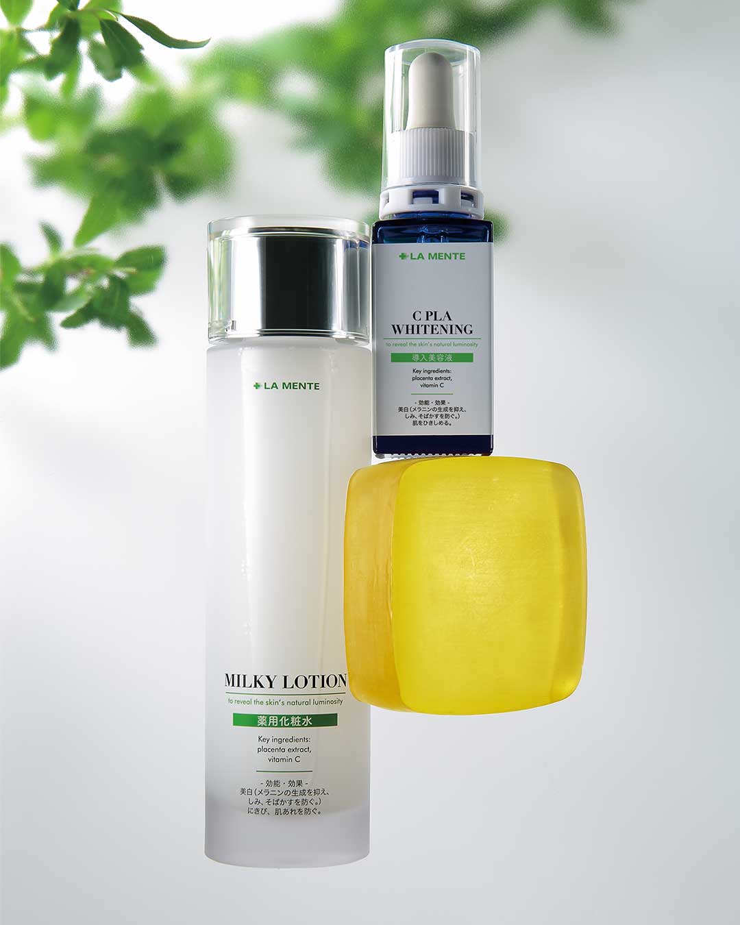
Determined to create an exciting experience, I designed the package using glimmering silver and shimmering black. Although they are usually white or brown, I made protective liners in black to enhance the overall visual. This visual makes the budget jump; I solved the issue and logistical processes by simplifying the structure and reducing the amount of material.

Brand reboot with
La Mente Basics
Designing a relevant visual language for new customers, and a more efficient distribution process for internal stakeholders.
Solution: design renewal
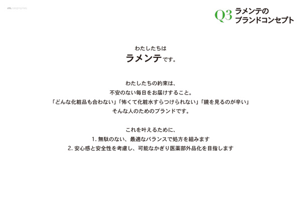
Starting by researching the consumer experience, brand history, and surveys in every internal division involved, I set three goals for this project: (1) Preserve the initial brand value, (2) improve the brand communication and out-of-box experience, and (3)clarify the campaign schedule and product release.
In executing the new visual design, I continued using the iconic, fresh color scheme of white and green while adjusting the shade to adhere to the upcoming generation.
Internal Proposal
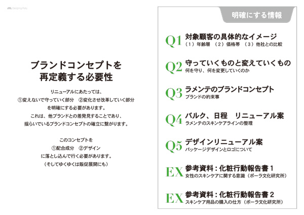
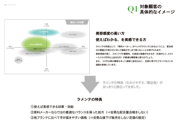
After the market research and competitive analysis, my team and I created a proposal deck to start the project. The 12-page deck begins by showing the renewed brand vision and statement alongside the renewed design. This deck also answers questions that the internal groups should have moving forward.
This deck was a rationale for the brand refresh and a translation of a design project for members who are not familiar with brand strategy. A significant chapter in the deck was the development schedule and a plan for both the release schedule and the marketing campaign for the following two years.