STARBUCKS for Accessible
Users(physical location)
Heuristic Research / User Persona / User Flow
Competitive Audit / Onsite Observation
Pratt Institute (2019)
User Experience Case Study
PROBLEM STATEMENT
One of the challenges which Starbucks has is the awkwardness of divided user exoerience between non-accessible users and accessible users.
This project suggests a solution for the efficient accessibility in STARBUCKS, especially in their physical location.


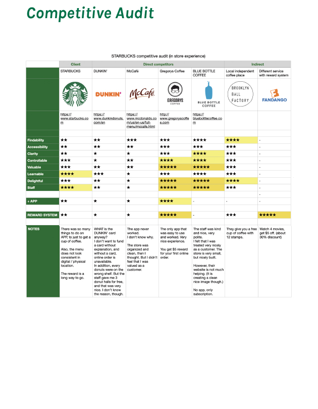
NOTES ON THE HEURISTIC RESEARCH
Findable: 2.8 / 2.1
Accessible: 1.3 / 1
Clear: 1.75 / 1.5
Communicative: 3.25 / 2.6
Findable: 2.8 / 2.1
- It was rather confusing
- No price is shown/small letters
- Easy to see the progress with the open kitchen
Accessible: 1.3 / 1
- Letters are legible
- Too many steps before getting a cup of coffee
Clear: 1.75 / 1.5
- No price is shown
- The menu is not consistent with the app/website
Communicative: 3.25 / 2.6
- Location/permissions are obvious
- There is always an actual human being to help
- The staff allows the usability
- Some of the staff remembers loyal customers
- Some of the navigation labels are not so clear
Credible: 3 / 2.8
- It is easy to contact a real person
- Design is not appropriate to the audience: The menu is not clear enough
Controllable: 2.6 / 1.8
- Tasks and needs are easy to accomplish
- Where to wait, to pick up is not clear
Valuable: 3.4 / 2.4
- It is desirable to the target user
- The staff improves the satisfaction of the user
Learnable: 4.2 / 3.2
- It is easy to recount/memorize
- The actual staff is always there to offer support in a more complicated process
Delightful: 3.6 / 2
- The behavior of the staff is the differentiator from the competitors
- The communication between the customers and the staff can be explored to the delightfulness