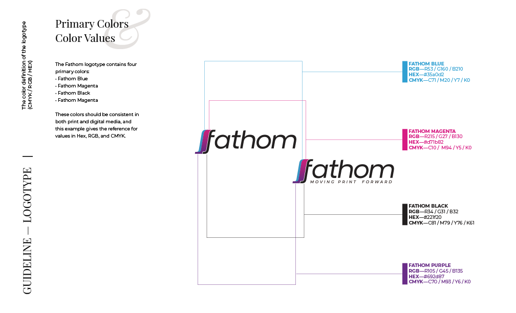
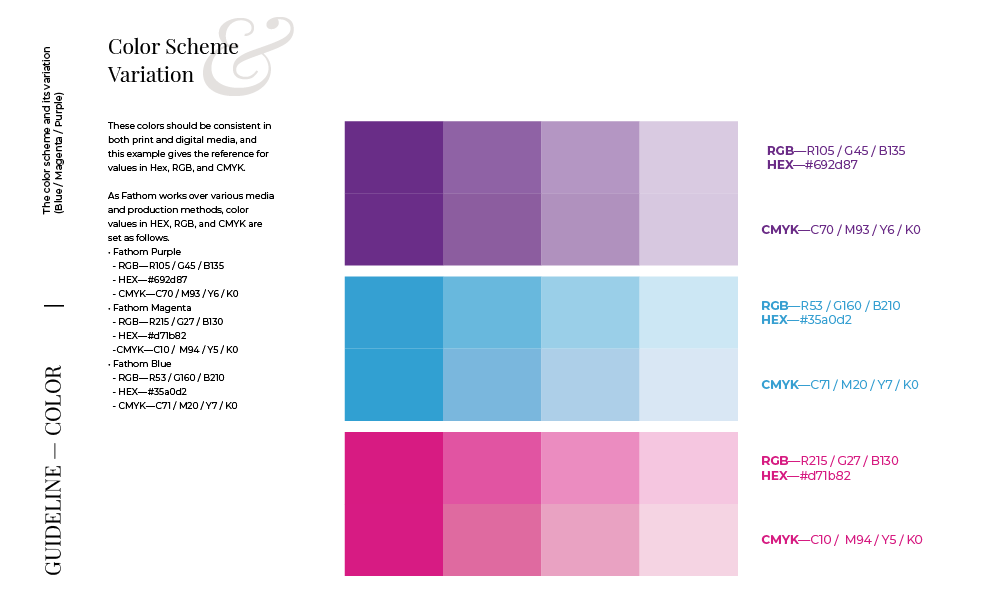
Building an identity for a tech startup
Corporate Identity for Fathom Optics
Corporate Branding, Visual Identity, Brand System, Communication Design
- Team: Fathom Optics
- Logo Design: Justin Hirsch
- Lead Designer: Hanna Shibata
OVERVIEW
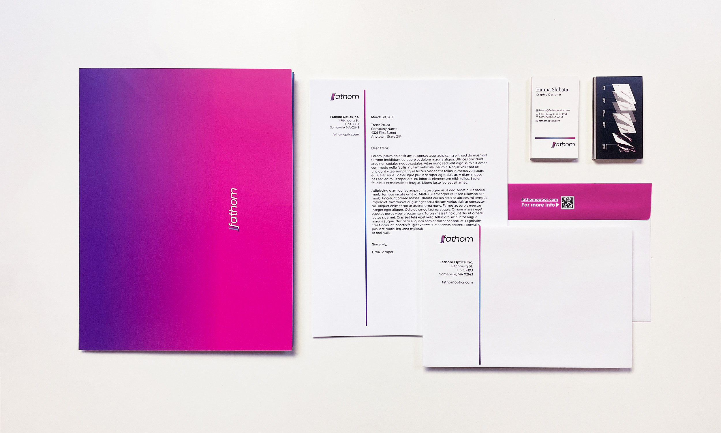
Fathom Optics Inc. comes from the Media Lab Spinoff at MIT. They have a brand-new idea about next-generation printing. At the very early stage of a startup, Fathom had a logotype with a tagline designed by one of the founders’ brother, typefaces they chose, and a brand guideline that was not quite familiar to everyone. They were also struggling to create cohesive brand communication and resources, so I volunteered to develop clear and easy-to-follow guidelines and help build a brand visual identity.
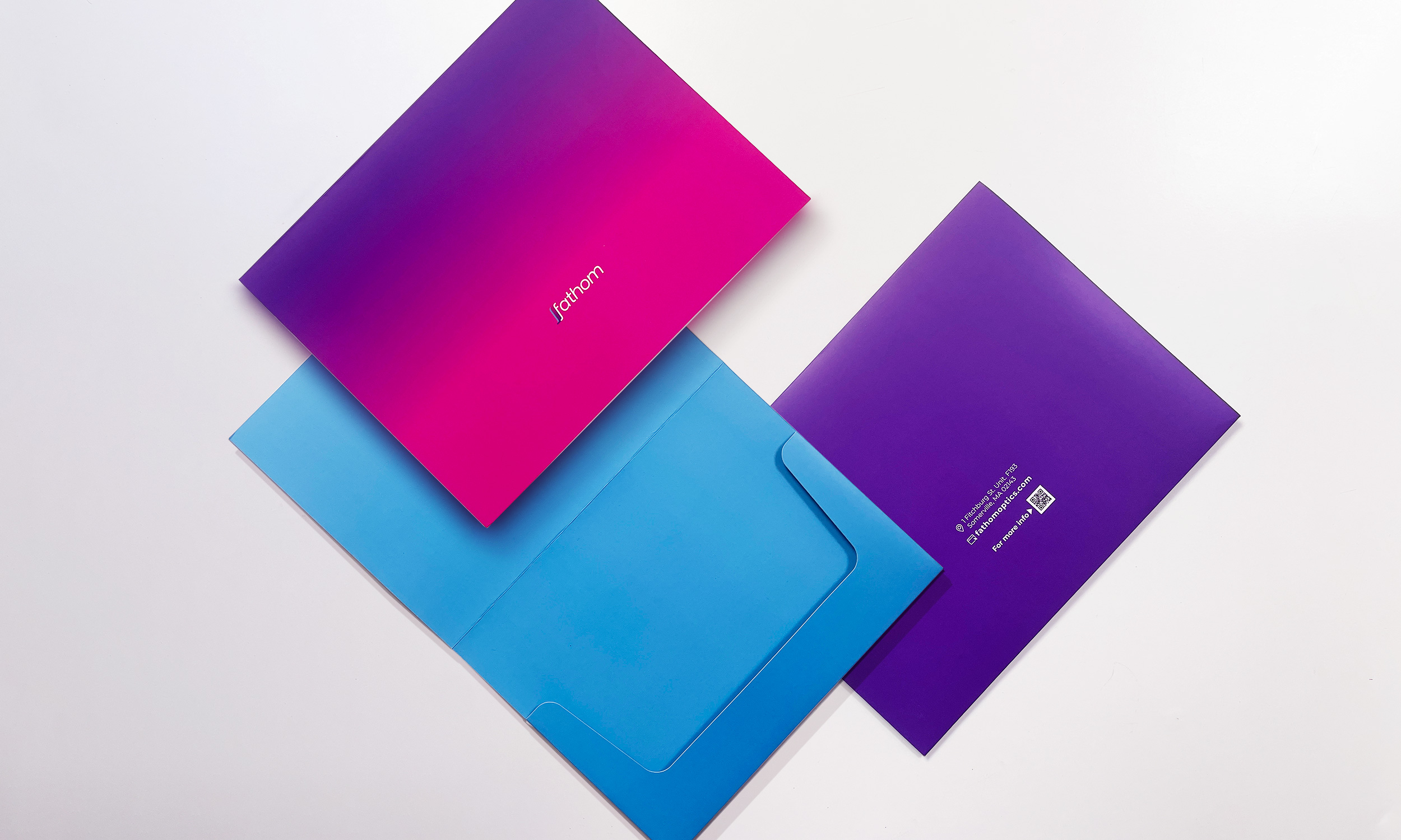
This project started by recognizing and rebuilding its brand identity. Alongside the brand guideline, I suggested a few templates for social media content. I also created communication tools such as letterhead, folder-type envelopes for sending out samples, business cards, etc., to support the overall brand communication and experience.
CHALLENGES
My colleagues had little experience understanding brands and how brand regulations can help preserve a consistent narrative when handled well. I wanted to help them by reorganizing the guidelines and making them simple and easy to use.
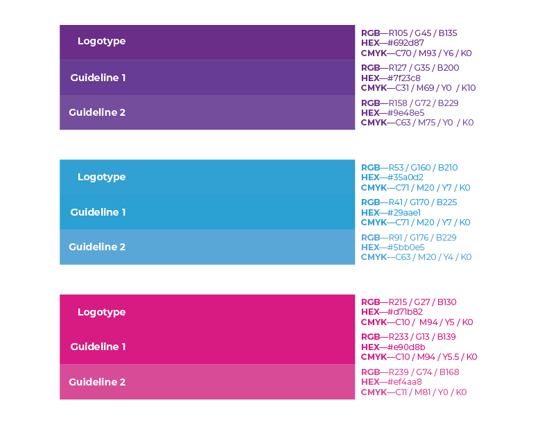
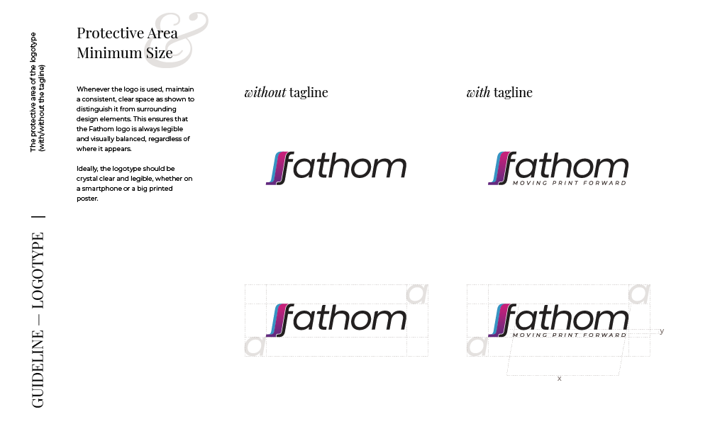
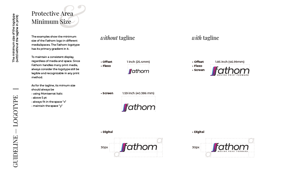
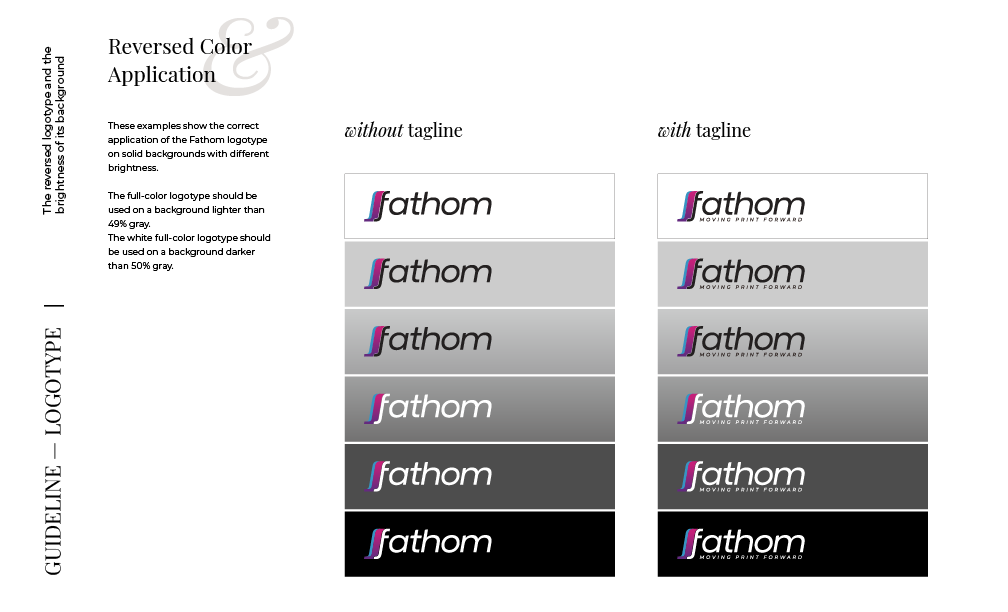
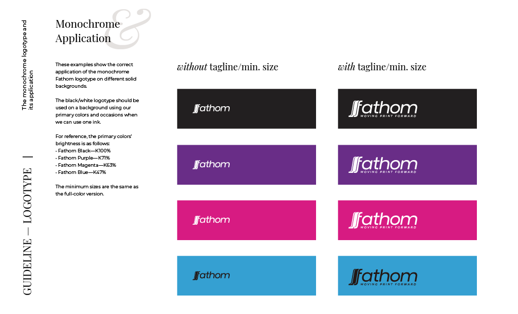
Since Fathom handles many prints and communicates through various social media channels, consistency was the top priority. One challenge was the logotype's scalability and replicability. For instance, I found out that there were three different shades of logo files used among my colleagues—what is the best way to address this when they are not aware of the issue?
SOLUTION
I talked to everyone inside and outside the design team to ensure that our publications followed the guidelines. I also started the conversation with the founders and the team about what our brand voice should sound like. It was a great exercise for everyone, allowing us to think deeper about the brand and elevate the company-wide communication strategy.
I set each guideline for digital/non-digital settings and made it as simple as possible, preserving the details, so the new corporate identity would help elevate the brand experience.


Brand Refresh for a Two-Decade Old Skincare Brand

La mente
Art Direction, Brand Strategy & Development, Package Design, Market Research, Project Management
- Brand Director: Hanna Shibata
- Art Director: Yoshimasa Saruya
- Photographer: Masato Sato
- Assistant Designer: Yuri Uratani
OVERVIEW
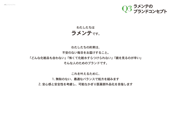
LA MENTE is a Japan Natural Laboratories' skincare brand that started around 2000, focusing on creating gentle skincare for delicate skin. The most unique feature of the brand is its exceptional formula and traceability of all the ingredients it uses. The company is part of a group that manufactures and processes raw materials for cosmetic ingredients. The amount and the concentration of active ingredients are incomparable to any other.
CHALLENGE
But how did they start to suffer as a brand? — The answer was the neglected brand equity.
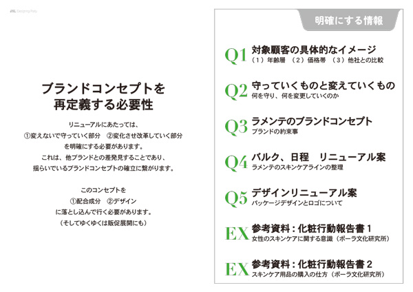
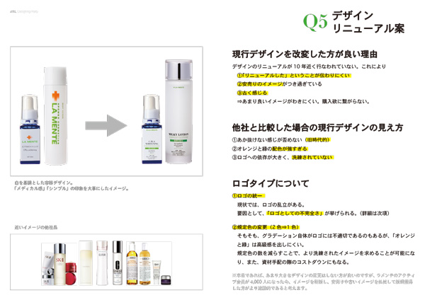
For almost 20 years, LA MENTE hasn't changed its design or brand lineup. While the brand was eating up its brand equity for more than 10 years, it was also suffering from scalping and cheap sales and desperately needed to develop new customers. Alongside the unauthorized reselling, another factor that destroyed the brand value was the loss of the guidelines and design regulations.
What can be a solution to this? — It was expanding the brand with adding new lineup and renewing the design language for the existing lineup.

Amplifying the brandscape
with La Mente Fino
An upgraded look and feel for a two-decade-long customers.
Solution: Brand Expansion
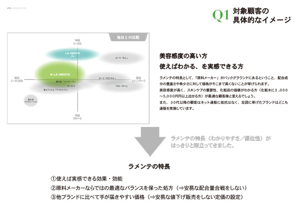
The first step to approach the project was rigorous research. It involved sorting out the remaining products in every size and material and analyzing customer and sales data. Based on the examinations and the budget, I restated the brand and adjusted the overall visual design of the product.
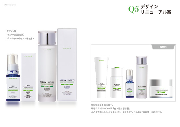
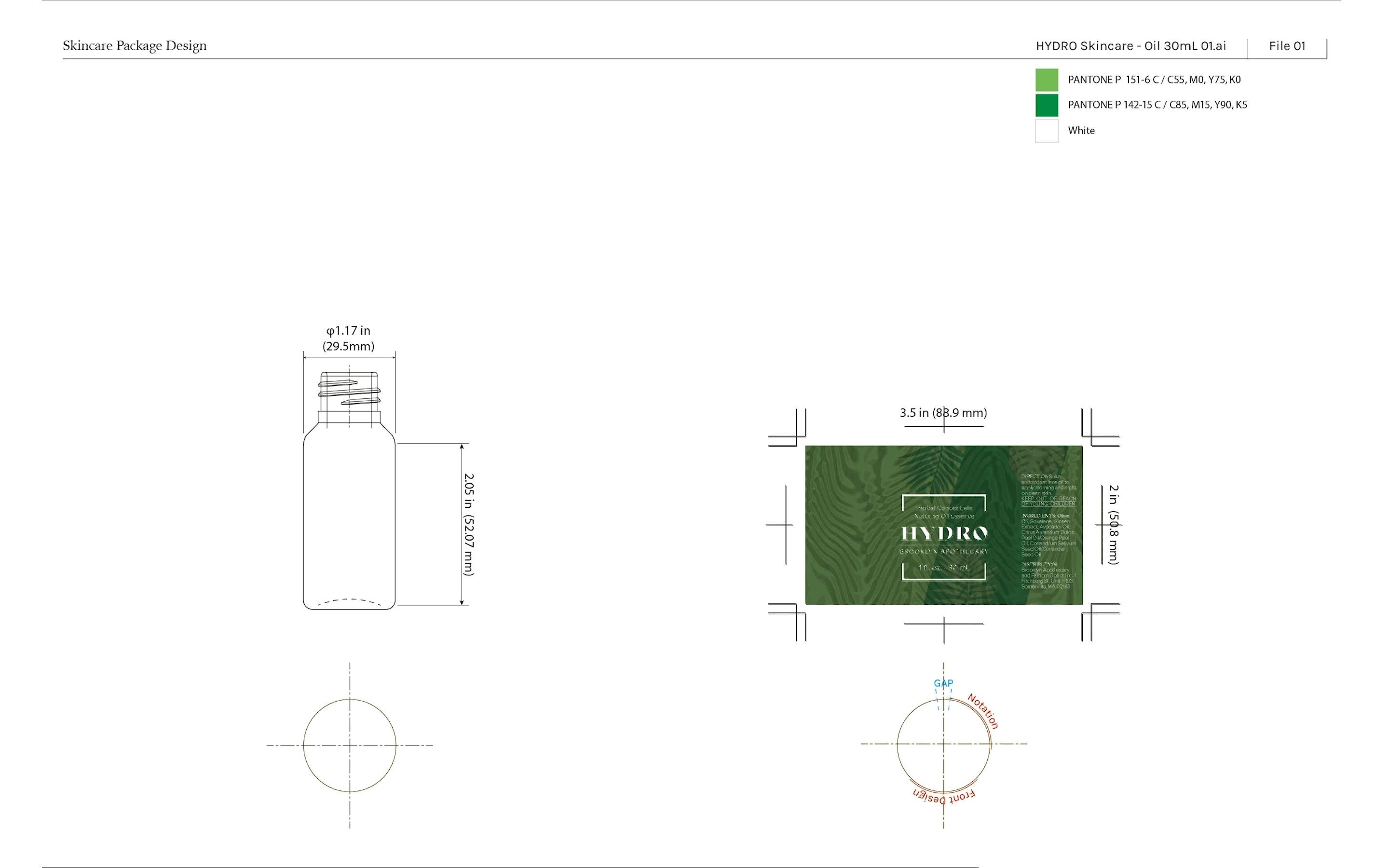
Determined to create an exciting experience, I designed the package using glimmering silver and shimmering black. Although they are usually white or brown, I made protective liners in black to enhance the overall visual. This visual makes the budget jump; I solved the issue and logistical processes by simplifying the structure and reducing the amount of material.

Brand reboot with
La Mente Basics
Designing a relevant visual language for new customers, and a more efficient distribution process for internal stakeholders.
Solution: design renewal
Starting by researching the consumer experience, brand history, and surveys in every internal division involved, I set three goals for this project: (1) Preserve the initial brand value, (2) improve the brand communication and out-of-box experience, and (3)clarify the campaign schedule and product release.
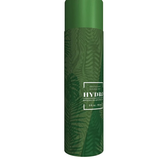
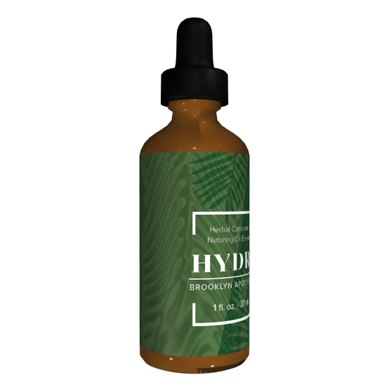
In executing the new visual design, I continued using the iconic, fresh color scheme of white and green while adjusting the shade to adhere to the upcoming generation.
Internal Proposal
After the market research and competitive analysis, my team and I created a proposal deck to start the project. The 12-page deck begins by showing the renewed brand vision and statement alongside the renewed design. This deck also answers questions that the internal groups should have moving forward.
This deck was a rationale for the brand refresh and a translation of a design project for members who are not familiar with brand strategy. A significant chapter in the deck was the development schedule and a plan for both the release schedule and the marketing campaign for the following two years.


Designing communication for a new technology
Content Design for Fathom Optics
Content Design, Client Proposals
- Team: Fathom Optics
- 3D modeling: Niko Arranz
- Designer: Hanna Shibata
OVERVIEW
A big part of my responsibilities at Fathom includes content design to tell a compelling story and create case studies for their technology — execute design projects using the Fathom application, developing client proposals and coming up with graphic language that efficiently reaches out to potential users. All the content aimed to drive conversation between clients and the company, promoting business opportunities within the industry.
CHALLENGE
The biggest challenge was that Fathom technology was so new that it was difficult to explain concisely. How would you tell someone that this print technology prints motion but you don't need any special material? It looks a bit like lenticular printing, but it's very different from it. What would be the proper application to show people that Fathom is pushing the limitation of print in a cost-effective, environmentally friendly way?
SOLUTION
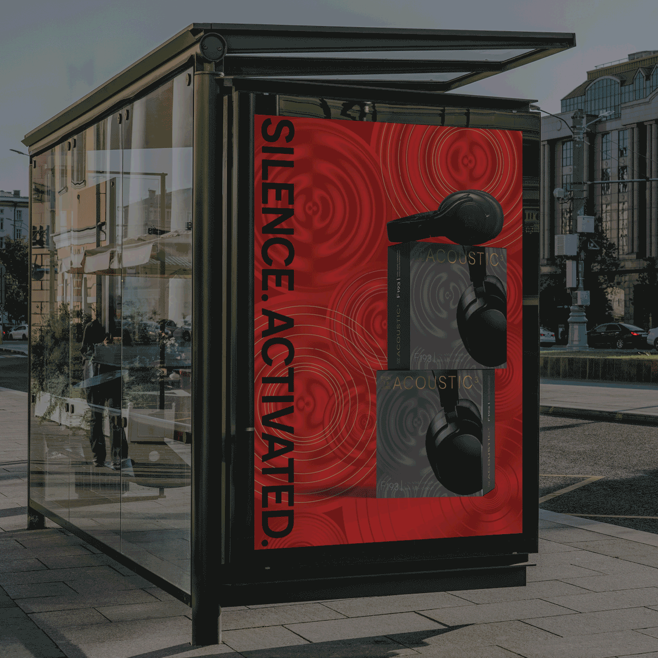
In the beginning, all of Fathom samples were beer labels, but Fathom did not want their technology to be about beer labels. (Of course, we all love craft beer on the East Coast, but we wanted more.) They wanted to show how package design can look different, advertising can be more unique, and security features can be more robust. Based on the conversation I had with the founders, I came up with different design executions, creating new patterns for the Fathom application.
I also suggested that we show our behind-the-scenes. Because it is the most simple, strongest way to show that it is real, and we are having fun with it.

Design Solution for Gender Discrimination in Medical Field
Designing a cultivating platform
Brand Communication, Editorial Design, Infographic, Ethnographic Research, Online Survey, In-depth Interview
OVERVIEW
This project is a studio practice inspired by actual gender discrimination in the medical field, aiming to unite and empower medical students and professionals fighting against discrimination.
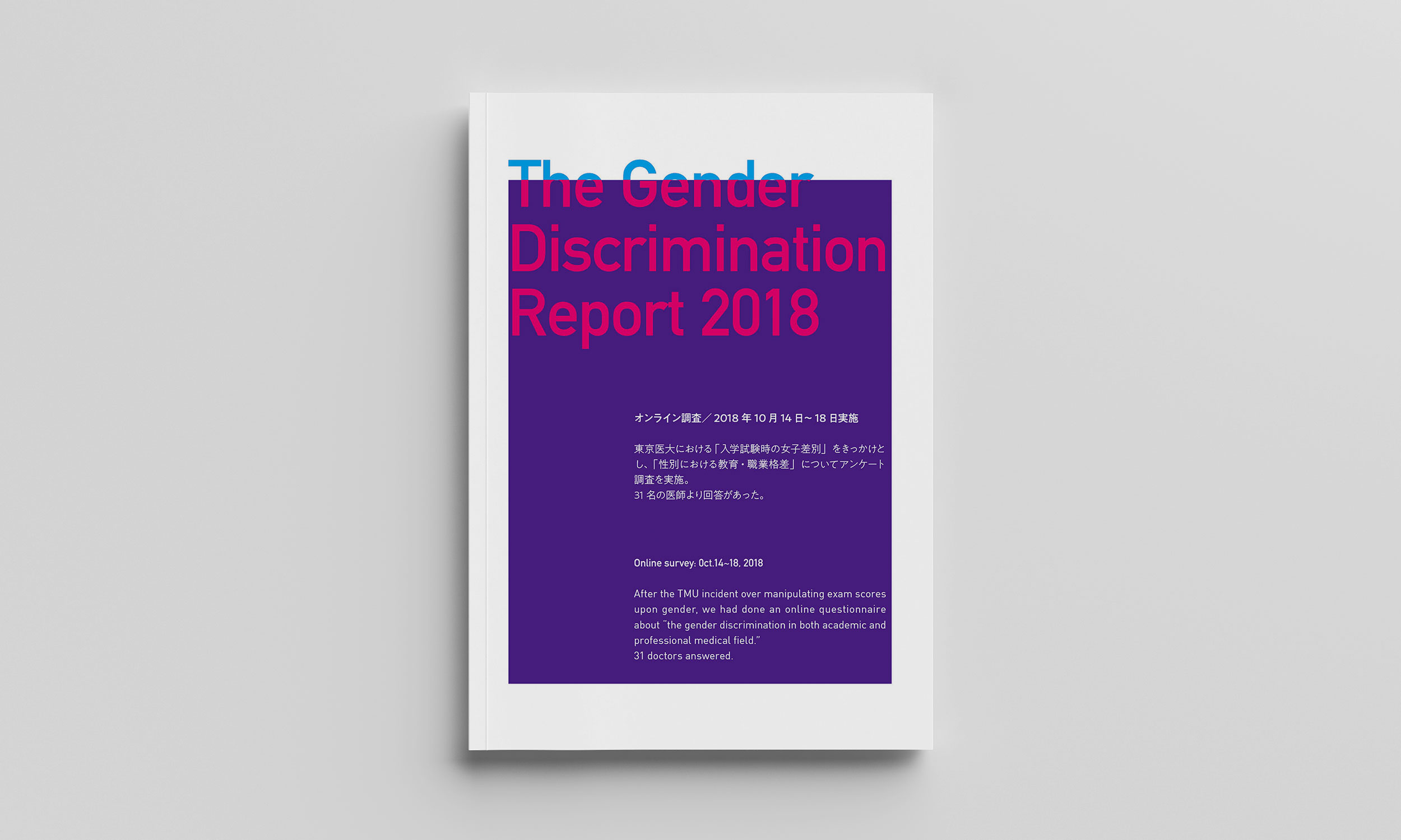
In the summer of 2018, the public discovered that Tokyo Medical University in Japan has been discriminating against students based on their gender and age on the entrance exam. This school was not the only institute involved in this incident, and even now, gender discrimination is still occurring in the academic and professional fields of medicine.
Challenge
How can design help to tackle big issues like this?


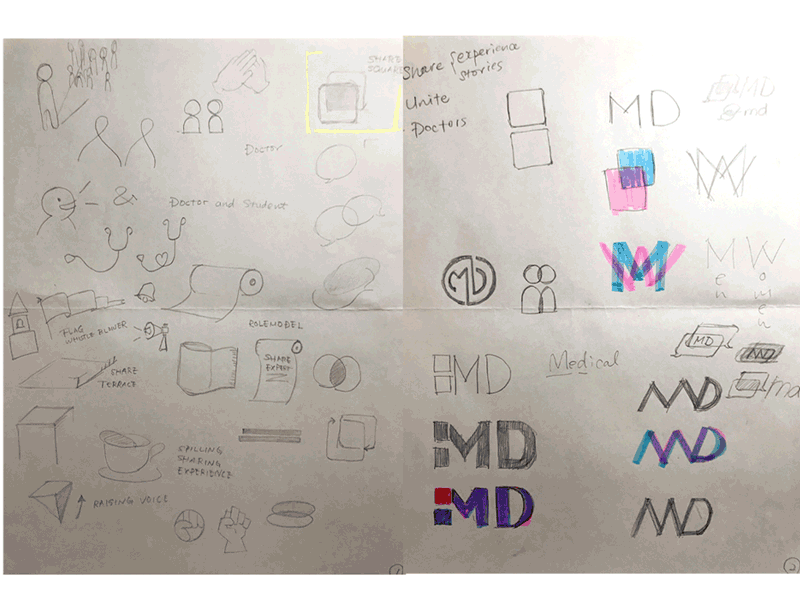
Solution & Outcome
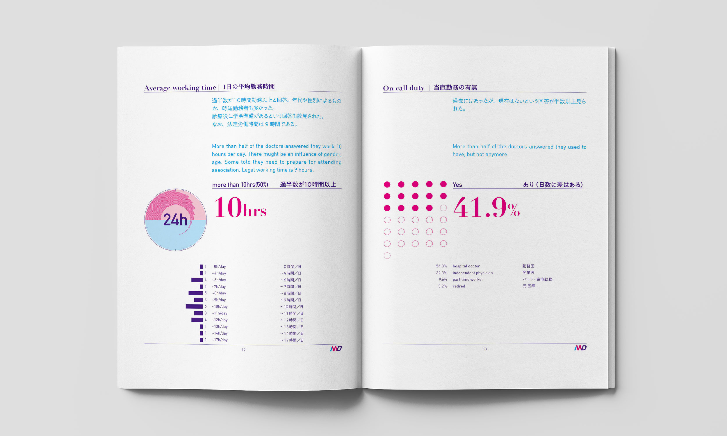
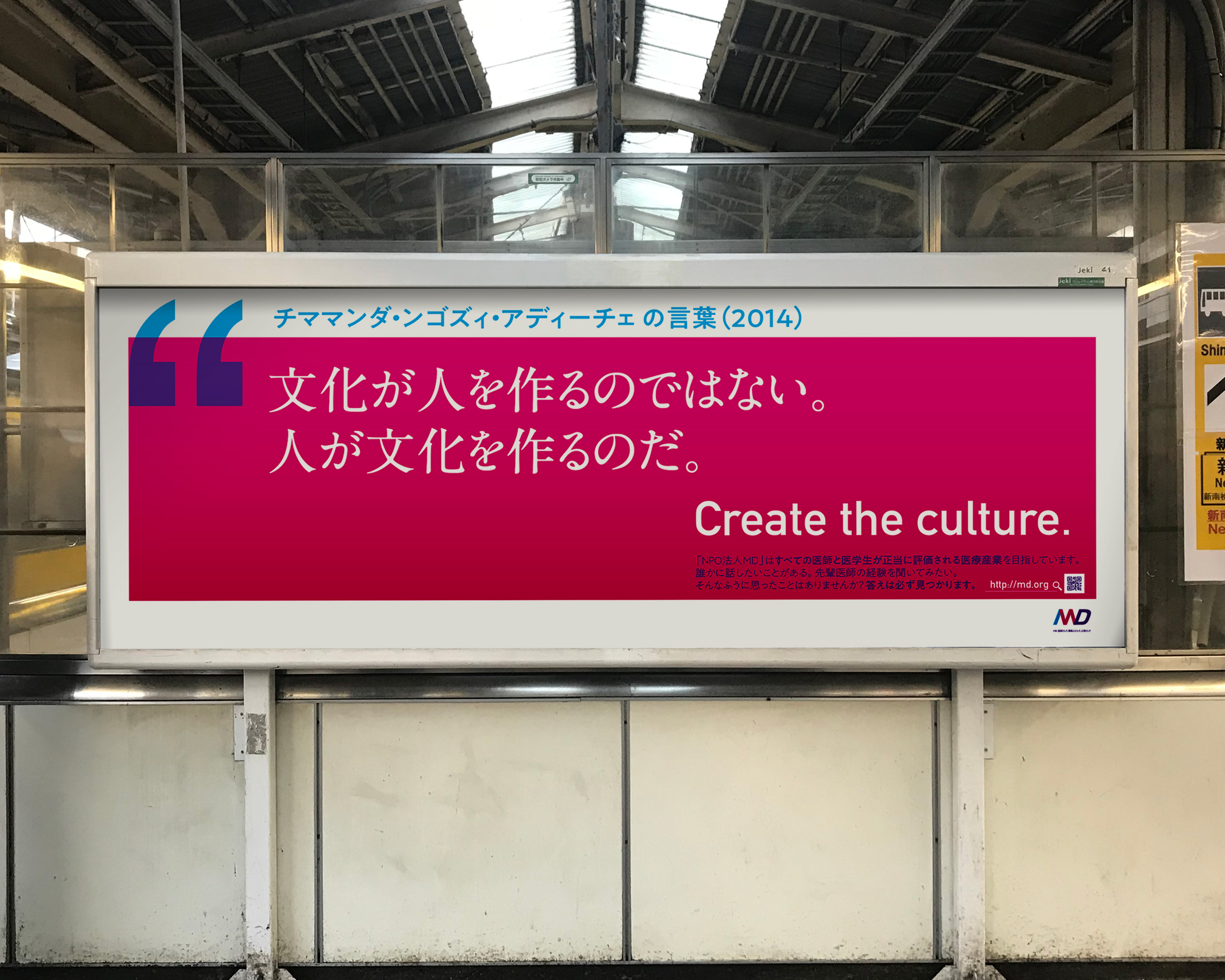
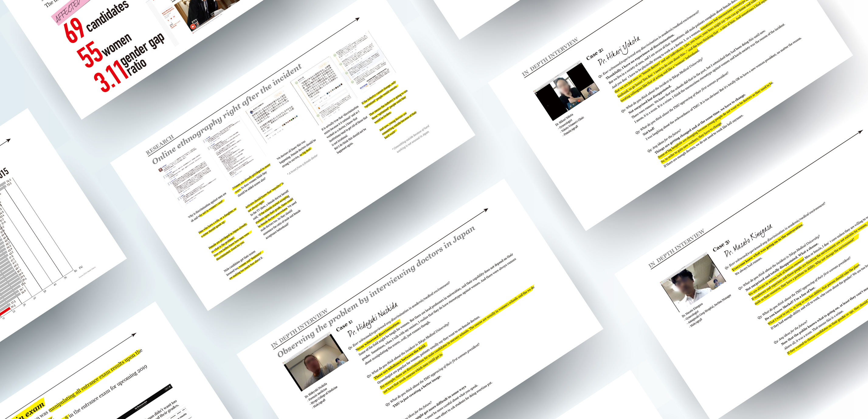
After discovering the incident, I contacted doctors and interviewed three in Japan over the 13-hour difference and conducted an online survey, which received more than 30 responses, mostly revealing their appalling experience of discrimination.
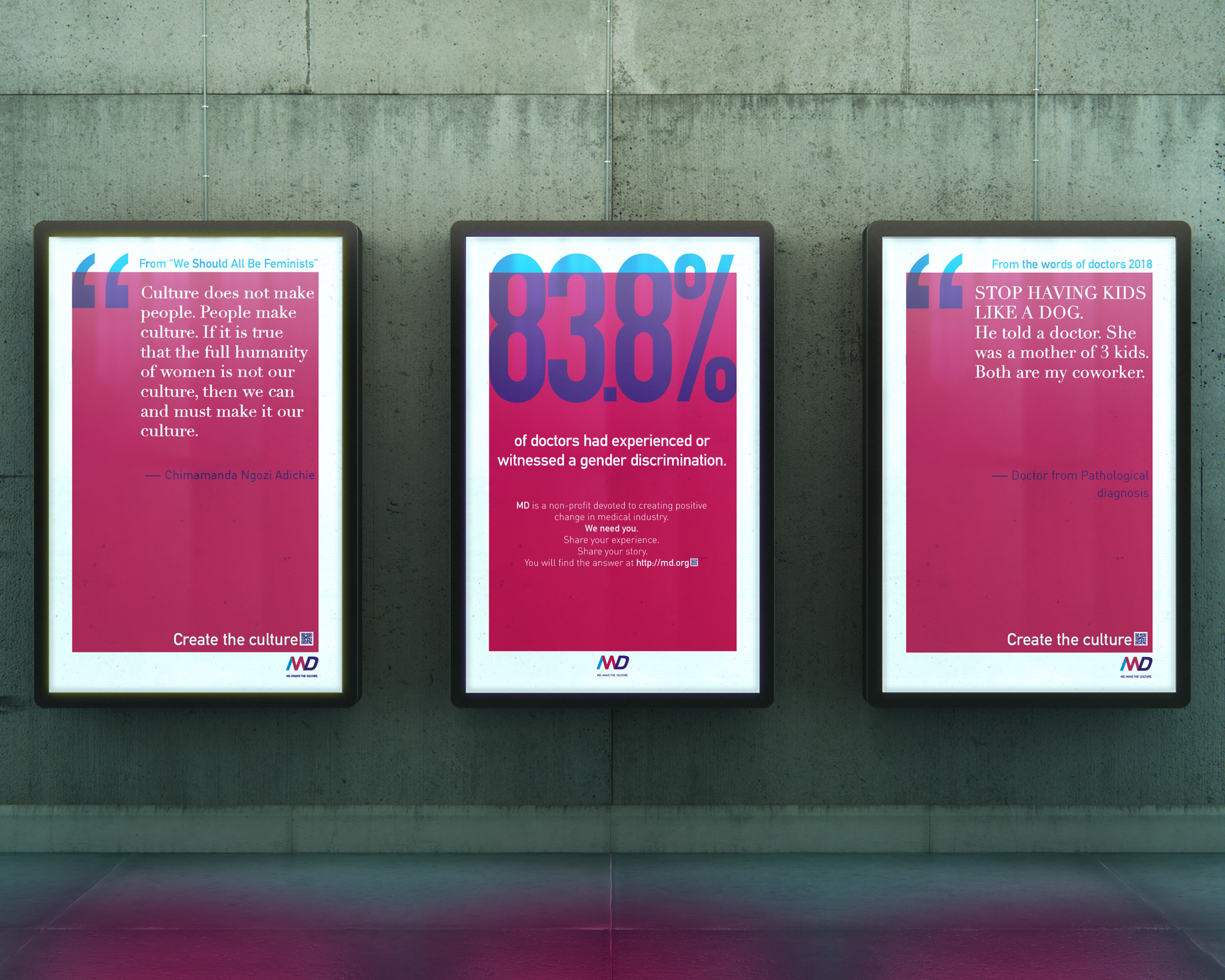
The visual language aimed to show how discrimination is happening right now. The amount of pink in each poster is precisely 83.8%, the ratio of doctors who shared their experience of gender discrimination in the survey. Quotes also come from the actual words from them.
I also chose to use English and Japanese for this project, pairing typefaces that should get along side by side in different environments. There is still an enormous gender gap in the industry, and two languages should allow the discourse of gender discrimination as a global issue.
One of the doctors who participated in the survey later contacted me and told me that she is now working to organize a cohort of doctors to fight gender discrimination in her workplace.